AI Children's Book Illustration Prompts: A Storyteller's Playbook for Midjourney and Nano Banana 2
Write children's book illustrations that feel hand-painted, not AI-generated. A complete prompt playbook with style recipes (watercolor, gouache, crayon, flat vector), character consistency tricks, page-layout templates and the small details that make editors say yes.
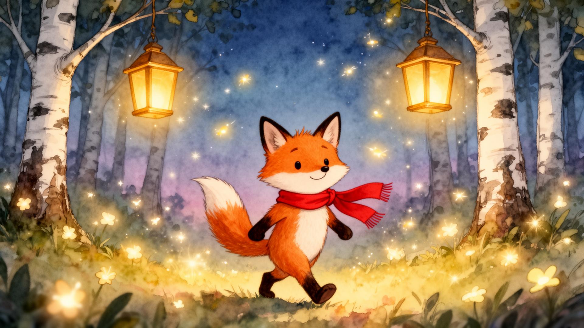
Table of contents
- Why most AI children's book illustrations fail
- The six-part prompt skeleton
- Why the order matters
- The medium cheat-sheet
- Classic watercolor
- Gouache and colored pencil
- Textured collage
- Crayon and pastel
- Flat vector / modern picture book
- Dreamy pastel digital
- Character consistency: the trick that actually works
- A worked DNA paragraph
- Lighting and emotional temperature
- Page layout: the slot most prompters skip
- Copy-paste templates by story beat
- Opening spread — the world before the journey
- Inciting incident — something changes
- Adventure middle — out in the world
- Scary moment — the dip
- Resolution — the safe return
- Closing endpaper or final image
- Midjourney V7 vs Nano Banana 2 for picture books
- Midjourney V7
- Nano Banana 2
- The small finishing details
- The dead giveaways to fix in editing
- From single pages to a finished book
- The bigger picture: AI as a draft partner
Children's book illustration is the hardest test for any image model. The bar isn't realism — it's charm. A picture book lives or dies on whether a four-year-old wants to turn the page, and whether their parent doesn't get bored on the fortieth read. Most AI illustrations fail both tests. They're slick, generic, and lit like a stock photo. They don't feel like books.
I've spent the last six months helping indie authors, illustrators and a couple of small publishers ship picture books made (or assisted) with AI. The ones that work share the same handful of prompting habits. This playbook is the working version of those habits — a six-part skeleton, a style cheat-sheet that actually triggers the right visual library, the character-consistency tricks that solved the biggest blocker last year, page-layout templates for spreads, and the small finishing details that turn a render into an illustration.
Why most AI children's book illustrations fail
Type "cute fox in a forest, children's book style" into any model and you'll get a render that looks like every other AI fox in every other AI forest. Same big eyes. Same purple-blue gradient sky. Same suspicious lack of brushstrokes. It reads as AI immediately — and worse, it reads as generic.
A children's book illustration that holds up next to Oliver Jeffers, Jon Klassen or Beatrix Potter needs six things, in this order:
- Character — who the protagonist is, in concrete visual terms.
- Action and moment — what they are doing, and the emotional beat.
- Setting — where, with one or two specific environmental anchors.
- Illustration medium — the named technique (watercolor, gouache, crayon, flat vector, collage).
- Lighting and mood — time of day, light quality, emotional temperature.
- Layout and composition — page format, focal point, where the text will sit.
Miss any one of these and the illustration regresses to generic AI children's art. Hit all six and you get a page that an editor will actually consider.
The six-part prompt skeleton
Here's the skeleton I use for every page. Fill in the brackets, ship it, iterate.
[Character description], [action and emotion], in [setting with one specific anchor], [illustration medium] illustration, [lighting and mood], [composition and page layout], children's picture book style, hand-painted texture, charming and warm
A worked example for a bedtime spread:
A small sleepy brown bear cub with a patch of white fur on his chest, yawning and rubbing one eye with his paw, curled up in a cozy hollow at the base of a giant oak tree, soft watercolor and colored pencil illustration, warm moonlight filtering through autumn leaves, double-page spread composition with the bear on the right and empty sky on the left for text, children's picture book style, hand-painted texture, gentle and dreamy
Run that through Midjourney V7 or Nano Banana 2 and you'll get a render that could sit comfortably between two pages of a real book. Strip out the empty sky on the left for text and you lose the layout. Strip out watercolor and colored pencil and the medium goes mushy. Strip out patch of white fur and your character won't survive page two.
Why the order matters
Image models weight the early tokens of a prompt more heavily than the late ones. Lead with the character — not the style. If you bury small sleepy brown bear cub at the end of a long medium description, the model treats the bear as an afterthought and gives you a beautiful empty forest with a generic creature in it. Lead with who the story is about and the model builds the rest of the scene to serve them.
Tip: Write the prompt the way you'd describe the illustration to another illustrator. Short bursts of vivid description, comma-separated. Not a paragraph, not a sentence. Just visual nouns and verbs.
The medium cheat-sheet
Picking the right illustration medium is the single biggest visual decision you'll make. "Children's book style" on its own is meaningless — there are at least a dozen distinct styles, and the model has training data for each. Name the one you want.
Classic watercolor
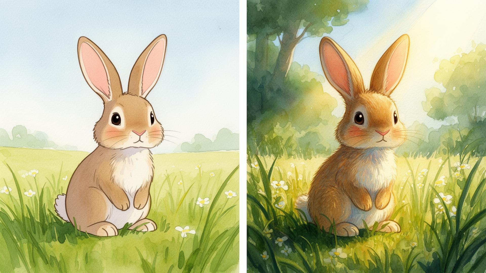
Soft washes, visible paper texture, organic edges. Beatrix Potter, Eric Carle's quieter pages, Jon Klassen's lighter work. Triggers: soft watercolor wash, visible paper grain, organic edges, muted earth palette, hand-painted, gentle pencil outline.
Gouache and colored pencil
Slightly chalkier and more saturated than watercolor, with crisp lines. Oliver Jeffers, Beatrice Alemagna. Triggers: gouache and colored pencil, matte saturated colors, visible brushstrokes, hand-drawn pencil contour, slightly textured paper.
Textured collage
Cut-paper layers, mixed media, joyful and tactile. Eric Carle, Lauren Child. Triggers: cut paper collage, layered textures, mixed media, hand-torn edges, painted papers, bold flat shapes with texture.
Crayon and pastel
Childlike, energetic, slightly rough. Quentin Blake, Marc Boutavant. Triggers: crayon and oil pastel, energetic loose lines, slightly rough texture, bright primary palette, playful childlike marks.
Flat vector / modern picture book
Clean shapes, limited palette, contemporary. Jon Klassen at his most graphic, Christian Robinson. Triggers: flat vector illustration, limited muted palette, simple geometric shapes, modern picture book style, subtle grain overlay.
Dreamy pastel digital
The big 2026 indie-author look. Soft gradients, glowing highlights, magical realism. Triggers: soft pastel digital illustration, dreamy glow, subtle gradients, magical realism, painterly digital brushwork.
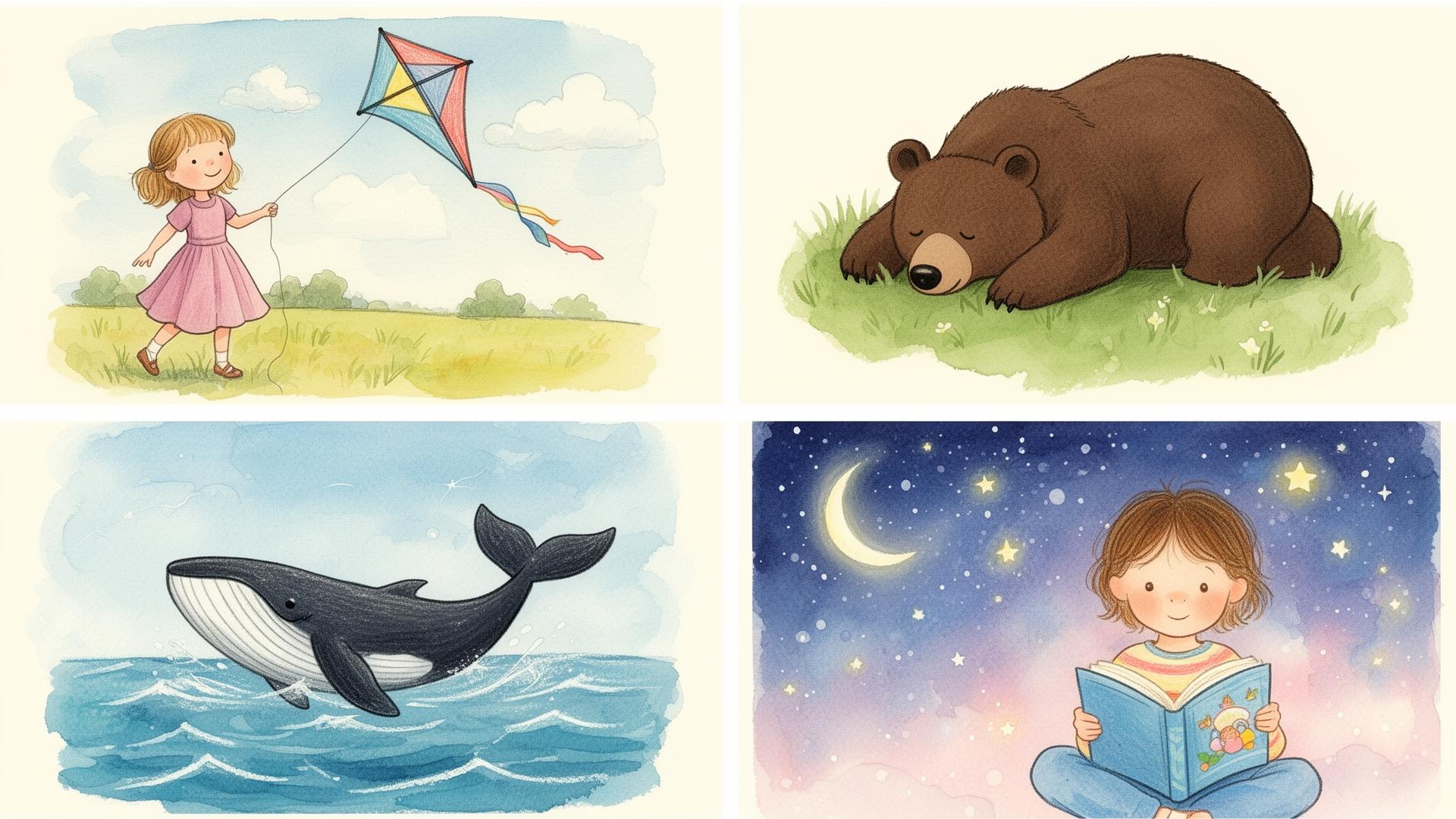
Warning: Don't mix more than one medium per book. Picking watercolor for one spread and flat vector for the next will break visual continuity and the book will read as a portfolio, not a story. Pick one medium per project.
Character consistency: the trick that actually works
A year ago this was the biggest blocker. You'd nail a character on page one and lose them by page three — different fur color, different ears, different vibe. In 2026 the workflow is much cleaner.
The pattern that works across both Midjourney V7 and Nano Banana 2:
- Write a character DNA paragraph. Three to five very specific, visual traits. Not personality — visuals. Small brown bear cub, round face, oversized ears, single patch of white fur on chest, wears a tiny blue knitted scarf, slightly clumsy posture.
- Lock a reference image first. Generate the character in isolation on a plain background. Pick the one you love. Save it.
- Use the reference on every subsequent prompt. In Midjourney V7 use
--cref [image url] --cw 100to lock character weight. In Nano Banana 2, attach the reference image directly and write "keep the same character as the reference image" at the start of the prompt. - Repeat the DNA paragraph in every prompt. Even with a reference image, restating the visual traits in words reinforces them. Belt and braces.
- Generate the whole book in a single session. Style and character drift between sessions even with the same prompts. Block out a few hours and do all the spreads in one sitting.
A worked DNA paragraph
Lumi is a small brave fox cub with bright russet-orange fur, a snow-white belly and tail tip, oversized triangular ears tipped in dark brown, large round amber eyes, and a long red knitted scarf that trails behind her. She has a curious, slightly mischievous expression and walks with a bouncy, eager step.
Paste that block at the top of every prompt for the book. Pair it with a locked reference image. Lumi will survive thirty-two pages.
Lighting and emotional temperature
Children's book lighting is rarely literal. It's emotional. A scary moment isn't lit with a 5600K daylight balance — it's lit with deep blue shadow and a single warm window in the distance. A safe moment isn't lit with even softboxes — it's lit with a fireplace glow and amber lamp light raking across a quilt.
The lighting vocabulary that actually moves the needle:
- Warm golden hour through autumn leaves — wonder, adventure, beginning of a journey
- Soft blue moonlight with a single warm window — safety in the middle of fear
- Overcast diffused daylight with desaturated palette — quiet, contemplative, sad spreads
- Firelit interior with deep amber glow — comfort, home, the end of the story
- High-contrast spotlight on the character, soft dark surroundings — the brave moment
- Soft pastel dawn light, pale pink and lavender sky — hope, new starts, final page
Drop one of these into the lighting and mood slot of the skeleton and the spread suddenly has emotional weight.
Page layout: the slot most prompters skip
A children's book is a sequence of page layouts, not just illustrations. Where the text sits matters as much as what's in the picture. Tell the model.
The four layout types you'll use ninety percent of the time:
- Full-bleed spread, text on a quiet area — "double-page spread, character on the right third, empty soft sky on the left for text"
- Half-page illustration above text — "horizontal landscape illustration filling the top half of the page, lower half empty for text block"
- Vignette with white space — "small centered illustration on a clean white page, surrounded by generous white space, vignette style with soft fading edges"
- Spot illustration — "small detailed spot illustration, no background, painted directly on white paper, hand-cut feel"
Specify the layout in every prompt. The model will compose the illustration around the empty space instead of cramming the action edge-to-edge.
Copy-paste templates by story beat
These are the templates I keep in a working document. Swap the character and setting bits to match your story.
Opening spread — the world before the journey
[Character DNA], [doing a small everyday action] in [home setting with one cozy anchor], soft watercolor illustration with visible paper texture, warm morning light through a window, full-bleed double-page spread with the character on the left third and empty wall space on the right for opening text, children's picture book style, gentle and inviting
Inciting incident — something changes
[Character DNA], [reacting with curiosity or surprise] as [unusual element enters the scene], soft watercolor illustration, warm slanting afternoon light, slight high-contrast on the character to draw the eye, full-bleed spread, lower right corner empty for text, children's picture book style, sense of quiet wonder
Adventure middle — out in the world
[Character DNA], [walking, climbing, exploring] through [a vivid new setting with one specific landmark], soft watercolor and colored pencil illustration, dappled golden hour light, painterly brushstrokes, full-bleed double-page spread with horizon line one-third from the top, ample sky for text, children's picture book style, sense of adventure
Scary moment — the dip
[Character DNA], [a small fearful gesture — clutching scarf, peering around a corner], in [a darker version of the setting], soft watercolor illustration with a desaturated cool palette, deep blue moonlight with a single warm distant window, high-contrast spotlight on the character, full-bleed spread, empty dark sky on the left for sparse text, children's picture book style, gentle suspense not horror
Resolution — the safe return
[Character DNA], [curled up, smiling, held] in [the cozy home setting from the opening, now warmer], soft watercolor illustration, firelit interior with deep amber glow raking across the scene, full-bleed double-page spread, empty quilt or wall on the right for closing text, children's picture book style, warmth and relief
Closing endpaper or final image
[Character DNA] [in a small symbolic pose — sleeping, waving, looking up at stars], soft watercolor vignette on a clean cream paper background, painterly fading edges, small centered composition with generous white space, children's picture book style, quiet and tender
Midjourney V7 vs Nano Banana 2 for picture books
Both models can ship a children's book. They have very different sweet spots.
Midjourney V7
- Better at: painterly textures, atmospheric lighting, watercolor and gouache mediums, full-bleed dramatic spreads, magical realism.
- Weaker at: absolute character consistency across many pages, simple flat vector styles, hands on small characters.
- Use these parameters:
--ar 16:10 --style raw --stylize 250for spreads, drop to--stylize 100for tighter editorial control, push to--stylize 500for dreamier pages. - Character locking:
--cref [reference url] --cw 100on every prompt after the first.
Nano Banana 2
- Better at: character consistency across many generations, clean flat vector and modern picture book styles, exact compositional control, reliable layout (text-safe areas actually stay empty).
- Weaker at: the loosest, most painterly watercolor textures — it sometimes over-cleans them.
- Use it for: the book where character consistency matters more than texture. Indie chapter book covers, vector picture books, comic-adjacent illustrations.
- Character locking: attach the reference image directly, and lead the prompt with "keep the same character as the reference image, do not change the design."
The pragmatic answer for most indie authors: draft the whole book in Midjourney for mood and texture, then re-roll any pages where the character drifted using Nano Banana 2 with the best Midjourney render as a reference.
The small finishing details
These are the touches that separate a render from an illustration. Add one or two per prompt. Don't add all of them.
- visible paper grain
- hand-painted texture
- slightly off-register colored pencil outline
- soft pencil contour line
- subtle painterly imperfections
- muted earth palette
- hand-torn paper edges
- gentle vignette fading at the corners
- slight scan texture overlay
- traditional media feel, not digital
These cues tell the model to stop optimizing — to leave the small imperfections that make hand-illustration feel hand-made.
The dead giveaways to fix in editing
Even great prompts produce small AI tells. Fix these before sending pages to anyone:
- Symmetrical faces with identical features — pick a different generation, or nudge the prompt with slight asymmetry, hand-painted irregularity.
- Floating eyes that don't quite focus — re-roll. Children's book characters need to be looking at something. Specify it: looking up at the moon, looking down at her paws.
- Hands with the wrong number of fingers on small characters — crop, repaint, or use the "hands hidden in pockets / behind back / holding object" dodge.
- Background detail that competes with the character — re-prompt with soft out-of-focus background, painterly bokeh, minimal background detail.
- Text-safe areas that aren't empty — be more aggressive: completely empty white sky on the left half, no clouds, no detail, pure paper for text.
From single pages to a finished book
A handful of beautiful renders is not a book. A book is a sequence with rhythm. Once your character is locked and your style is settled, plan the whole sequence on a single page before you generate anything:
- Write a one-line description of every spread.
- Mark the emotional beat of each spread (opening, wonder, fear, resolution, calm).
- Pick the lighting mood for each beat using the lighting list above.
- Decide the layout for each spread so the text has somewhere to live.
- Generate the whole book in one session, in order. Don't jump around — small style drift compounds.
Then live with the book for a week. Read it aloud to an actual child if you have one within reach. Re-generate the two or three spreads that don't sing. Ship.
The bigger picture: AI as a draft partner
The honest framing for anyone serious about picture books: AI is a brilliant first-draft partner and a mediocre final illustrator. It generates faster than any human, it explores style at the speed of thought, and it gives indie authors a way to see their story before paying an illustrator. It still doesn't replace an artist who knows your story, your character and your audience.
The workflow that's emerging among the authors I work with: draft the whole book with AI, lock the characters and the style, then pay a human illustrator to do final passes — repaint hands, fix faces, add the small narrative touches that the model can't see. The AI saves the illustrator the boring part and lets them focus on the magic. Everyone wins, including the kid who eventually reads it.
If you want to push your prompts further across other categories, the AI Interior Design playbook uses the same six-part skeleton applied to rooms, and the realistic AI images guide covers the photography vocabulary that translates back into more believable illustrated lighting. And whenever you're stuck on a single line, the PromptMint generator will turn a one-word idea like "loneliness" or "first day of school" into a full descriptive scene you can drop into either model.
Frequently asked questions
Which AI model is best for children's book illustrations in 2026?+
Midjourney V7 is the best choice for painterly, atmospheric and texture-heavy styles like watercolor or gouache. Nano Banana 2 is better when character consistency across many pages matters more than texture — for example flat vector picture books, modern indie covers and chapter-book interiors. Many indie authors draft the whole book in Midjourney and re-roll consistency-critical pages in Nano Banana 2 using the best Midjourney render as a reference image.
How do I keep my character consistent across every page of a picture book?+
Write a five-line visual DNA paragraph for the character (fur color, key markings, signature accessory, posture). Generate one clean reference image on a plain background. Then for every subsequent page, attach that reference (--cref with --cw 100 in Midjourney, or as an attached image in Nano Banana 2) AND restate the DNA paragraph in the prompt. Generating the whole book in a single session also reduces style drift.
What illustration style triggers the best results in AI?+
Naming a specific medium works far better than saying 'children's book style'. Useful triggers include soft watercolor with visible paper grain, gouache and colored pencil, cut-paper collage, crayon and oil pastel, flat vector with limited palette, and soft pastel digital with dreamy glow. Pick one medium for the whole book — mixing mediums breaks visual continuity.
How do I leave empty space on the page for text?+
Specify the layout directly in the prompt. Use phrases like 'double-page spread with the character on the right third and empty soft sky on the left for text', or 'horizontal illustration filling the top half of the page, lower half empty for text block'. Be aggressive — 'completely empty white sky, no clouds, no detail' works better than a polite suggestion.
Can I publish a children's book illustrated entirely by AI?+
Legally in most jurisdictions, yes — but the practical answer for serious indie authors is hybrid. AI gives you a brilliant first draft and saves enormous time on layout, mood and exploration. Final passes by a human illustrator (fixing hands, faces and narrative details the model misses) almost always raise the quality enough to justify the cost, especially for print runs.
How long does it take to illustrate a picture book with AI?+
With a locked character DNA, a chosen medium and the six-part skeleton ready, a thirty-two-page picture book takes most authors one to two focused days to draft. Refinement, hand fixes and final polish typically add another week. Compare that to three to six months for a traditional commissioned picture book.