AI Character Design Prompts: A Concept Artist's Playbook for Midjourney and Nano Banana 2
Design consistent, production-ready characters with AI. The six-part character prompt recipe, silhouette and shape language, style triggers from anime to AAA concept art, and copy-paste templates for heroes, villains, NPCs and mascots.
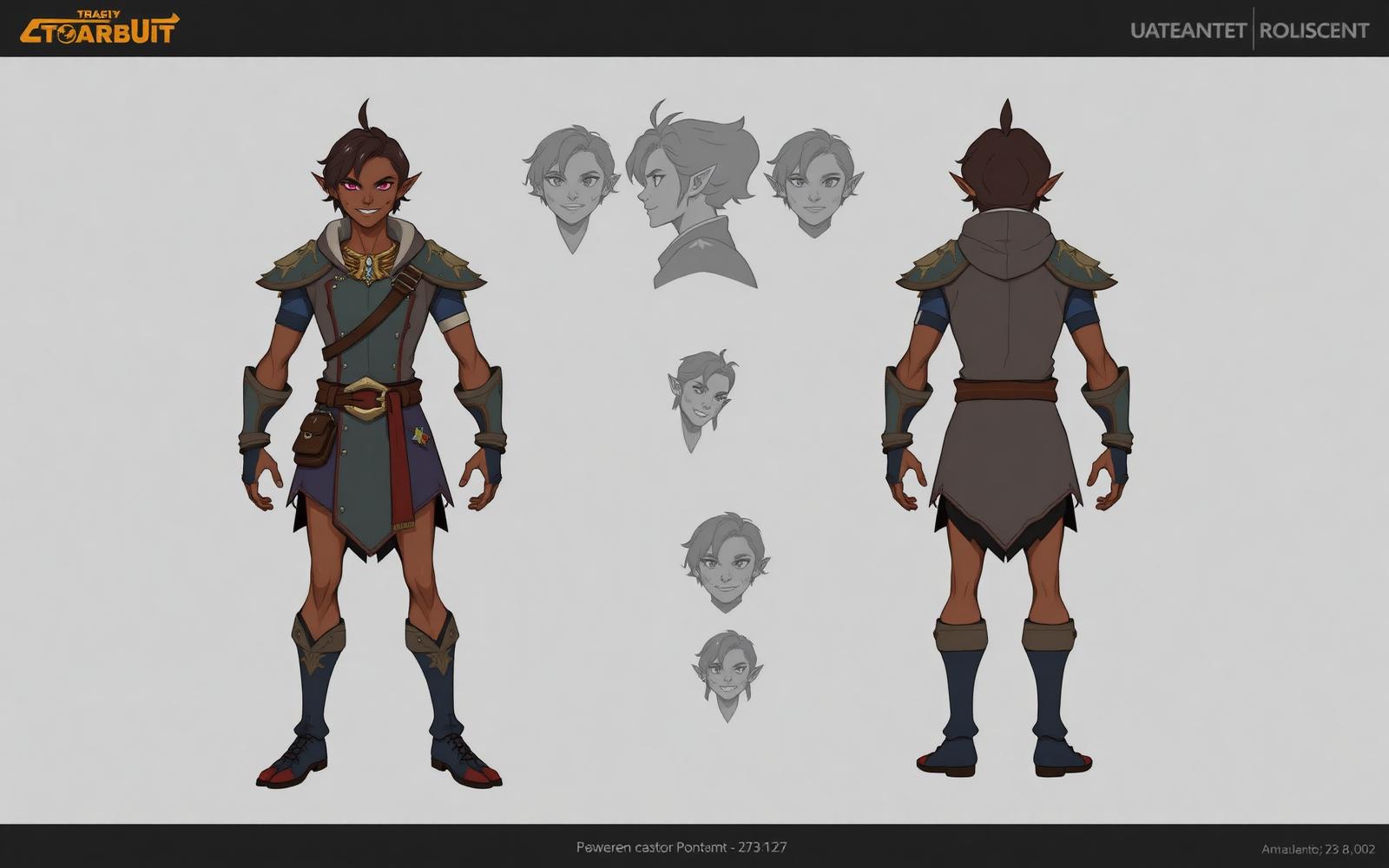
Table of contents
- Why most AI characters feel generic
- The six-part character prompt recipe
- Shape language — the shortcut to instant identity
- Costume logic that reads as intentional
- Style triggers that actually pull references
- Consistency across a character sheet
- 1. Write a "character DNA" paragraph
- 2. Use the model's reference tools
- 3. Generate a turnaround first, then variants
- Copy-paste templates
- Hero / protagonist turnaround
- Villain portrait
- Companion / sidekick
- NPC / background character
- Mascot / brand character
- Midjourney V7 vs Nano Banana 2 for characters
- Midjourney V7
- Nano Banana 2
- The finishing details that separate AI from portfolio-ready
- A worked end-to-end example
- The takeaway
Most AI-generated characters look like character-shaped things. The face is fine, the outfit is fine, the pose is fine — and yet the whole thing feels like a stock illustration nobody would ever put in a game, a comic or a pitch deck. There's no silhouette, no shape language, no clear archetype, no design decisions. Just a person in clothes, floating in a soft gradient.
Real character design is a discipline. It asks who this person is, what world they live in, what they wear because they need it and what they wear because they choose to. In 2026 both Midjourney V7 and Nano Banana 2 can hit that bar — if you prompt them like a concept artist instead of a customization screen. This is the working playbook I use for game pitches, indie comics and mascot work.
Why most AI characters feel generic
Type "a female warrior character" into any model and you'll get a woman in vaguely armored clothes with a sword, a neutral pose and a background that could be anywhere. It's competent and completely forgettable. The prompt didn't ask for a character. It asked for a category. You never told the model:
- Archetype — hero, villain, mentor, trickster, sidekick, everyman
- Silhouette / shape language — tall and angular, round and soft, squat and heavy
- World / genre — high fantasy, cyberpunk, post-apocalyptic, Saturday morning cartoon
- Costume logic — what they wear because of climate, class, job, personality
- Style reference — anime cel shading, Pixar 3D, Arcane painterly, Mike Mignola ink
- Presentation — front-facing turnaround, dynamic action pose, portrait, full body
Miss those and the model defaults to a Pinterest-average render. Hit them and it starts producing characters with actual identity.
The six-part character prompt recipe
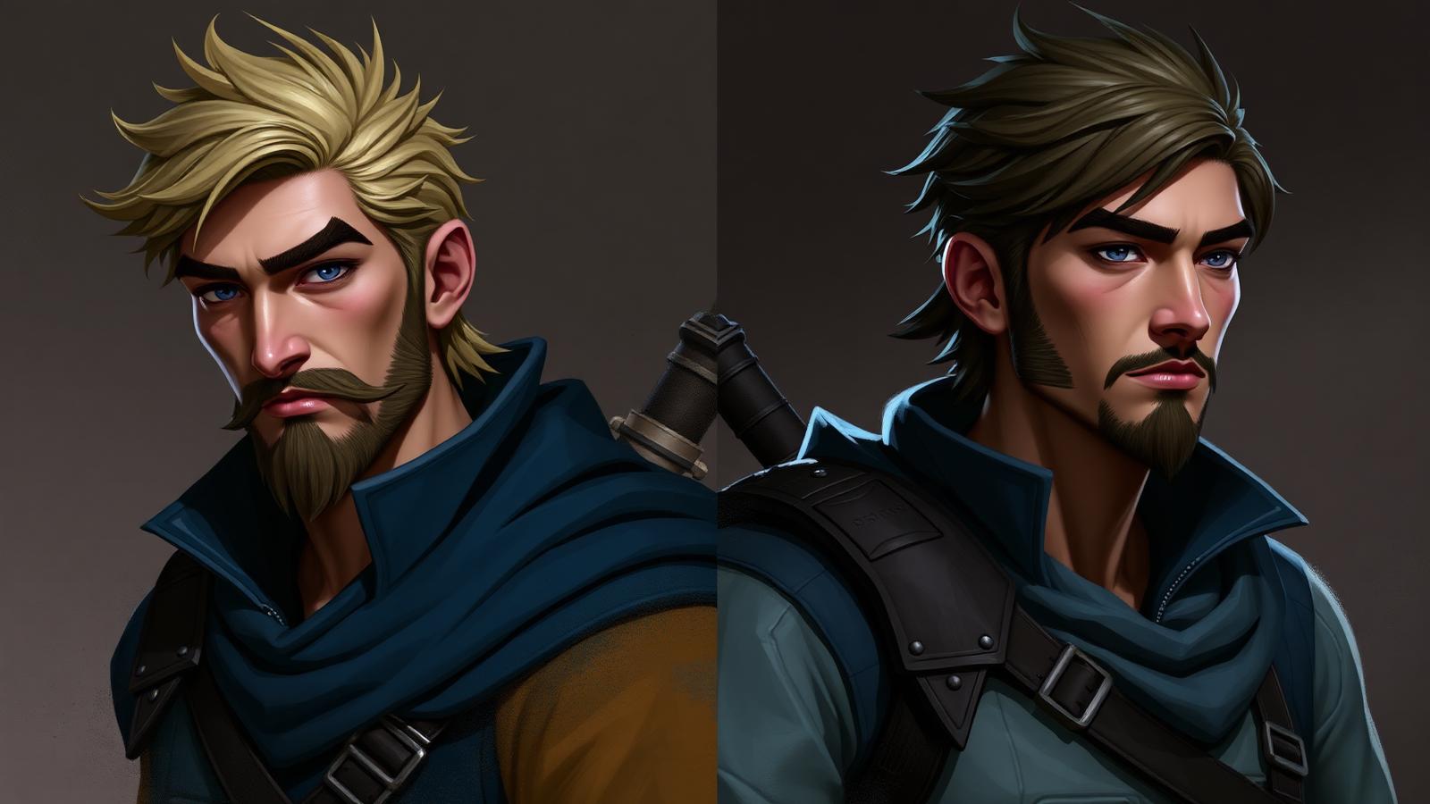
Every character prompt I ship has the same six slots. In order:
- Archetype + one-line personality — "a stoic veteran ranger, quietly grieving", "a chaotic teenage inventor, permanently caffeinated".
- Silhouette / shape language — "tall and lean with sharp angular shoulders", "short and round with soft flowing shapes", "broad and heavy, wide triangular base".
- World / genre — "in a rain-soaked cyberpunk city", "in a windswept high-fantasy tundra", "in a warm Studio Ghibli countryside".
- Costume + props — "layered oiled-canvas coat over patched leather armor, a lantern on the hip, an obsidian dagger".
- Style reference — "in the style of Arcane concept art, painterly with hard-edged shadows", "clean anime cel shading like Trigger Studios", "3D Pixar-style character sheet".
- Presentation / format — "full body character turnaround, front three-quarter view, neutral T-pose, plain studio background, concept art sheet".
Stitched together:
A stoic veteran ranger, quietly grieving, tall and lean with sharp angular shoulders, in a windswept high-fantasy tundra, wearing a layered oiled-canvas coat over patched leather armor, a lantern on the hip and an obsidian dagger, painterly concept art in the style of Arcane, hard-edged shadows, muted cool palette with a single warm accent, full body character turnaround, front three-quarter view, plain studio background, concept art sheet, high detail
That's the skeleton. Every variable below plugs into one of those six slots.
Shape language — the shortcut to instant identity
Concept artists talk about "circle, square, triangle" for a reason. Round shapes read as friendly, warm, harmless. Squares read as stable, honest, dependable. Triangles read as dangerous, aggressive, sharp. You can front-load an entire character's feeling with a single sentence.
- Round / soft — "round silhouette, soft flowing shapes, no sharp angles" → mentors, sidekicks, children, comfort characters.
- Square / blocky — "squared-off silhouette, boxy proportions, wide stable base" → tanks, dads, dependable warriors, blue-collar heroes.
- Triangular / sharp — "sharp triangular silhouette, angular shoulders, tapering forms" → villains, assassins, predators, high-status antagonists.
- Mixed with a dominant — "predominantly round shapes with a single sharp triangular accent (a spiked shoulderguard)" → complicates and makes memorable.
Name the shape language before you describe the costume. It rewires the model's baseline pose and proportions.
Costume logic that reads as intentional
Bad AI costumes are "armor with lots of details". Good AI costumes answer three questions in a single sentence.
- Function — what does this person need to survive their world? Layers for cold, mesh for heat, padded joints for combat, deep pockets for tools.
- Class / status — what can they afford? Repaired hand-me-downs, mass-produced uniform, custom-tailored silk, ceremonial regalia.
- Personality — one detail they added themselves. A charm on a belt, an oversized scarf, a color that doesn't match, a patch from a former unit.
Example: "a well-worn navy field coat with reinforced elbows and knees for kneeling in mud, standard-issue and clearly hand-repaired at the cuffs, a small hand-embroidered fox on the inside collar". That's one sentence and you already know who this person is.
Style triggers that actually pull references
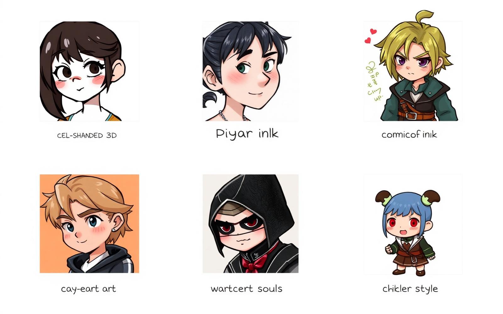
Generic style words ("stylized", "detailed", "beautiful") don't move the model. Named studios, artists and eras do.
- AAA game concept art — "in the style of Riot Arcane concept art, painterly with hard-edged shadows", "Naughty Dog character concept, grounded realism", "League of Legends splash art".
- Anime — "clean anime cel shading, Trigger Studios energy, thick lineart, flat color fills", "Ghibli watercolor character design, soft palette, gentle linework", "90s shonen manga ink".
- Western animation — "Pixar 3D character sheet, expressive proportions, appealing shapes", "Cartoon Network late-2010s style, thick outlines, bold flat color", "Disney feature animation appeal".
- Comic — "Mike Mignola ink and shadow, heavy black shapes, minimal detail", "European bande dessinée clear line, Moebius-influenced", "90s Image Comics, dynamic anatomy".
- Dark / gritty concept — "Dark Souls concept art, painterly, muted palette, oppressive atmosphere", "Frank Frazetta oil painting energy, high contrast, dramatic anatomy".
- Cute / stylized — "chibi sticker style, oversized head, tiny body, soft pastel palette", "Adventure Time noodle-limb energy, thin outline, bright flat color".
Pick one per generation. Blending two named studios usually cancels both out.
Consistency across a character sheet
The single hardest problem in AI character design is keeping the same character across multiple images. Three techniques that actually work in 2026.
1. Write a "character DNA" paragraph
Lock the character into a single reusable paragraph you paste into every prompt. Cover the immutable details: hair color and cut, eye color, skin tone, distinguishing marks, three signature clothing items.
"Iven, mid-30s, tall and lean, ash-blond hair cropped short on the sides and messy on top, cool grey eyes, a thin scar over the left eyebrow, always wearing a dark navy oiled-canvas coat, a leather bandolier with brass buckles, and a copper compass on a cord around the neck."
Paste that block first in every generation. Vary only what changes (pose, expression, environment).
2. Use the model's reference tools
- Midjourney V7 — attach a reference of the locked design and use
--crefwith the image URL. Combine with--cw 100(character weight) for strict consistency, or--cw 50when you want the style to shift slightly. - Nano Banana 2 — attach the reference image and prompt "same character as the reference image, identical face structure and clothing, new pose and environment only". It handles character preservation more literally than Midjourney.
3. Generate a turnaround first, then variants
Start with a proper character turnaround (front, three-quarter, side, back) on a plain background. Use that as your reference sheet for every subsequent generation — action poses, expressions, scenes. You're teaching the model the character once, then reusing it.
Copy-paste templates
Five templates I use weekly. Swap the brackets, keep the structure.
Hero / protagonist turnaround
[Name], [age] year old [archetype], [one-line personality], [shape language] silhouette, in a [world / genre], wearing [costume with function, status, personality], [style reference], full body character turnaround, front three-quarter view, neutral pose, plain studio background, concept art sheet, high detail, clear silhouette --ar 3:4
Villain portrait
[Name], a [one-line villain identity], sharp triangular silhouette with angular shoulders, [world], wearing [luxurious or menacing costume with one sympathetic human detail], [dark painterly style reference], portrait from waist up, dramatic three-point lighting, muted palette with a single saturated accent color, concept art, high detail --ar 3:4
Companion / sidekick
[Name], a [companion archetype], round warm silhouette, [world], wearing [practical costume with one whimsical personal detail], [warm animation style reference], full body, welcoming three-quarter pose, soft neutral background, character concept sheet --ar 3:4
NPC / background character
An unnamed [role — blacksmith / archivist / dockworker] in [world], [shape language] silhouette, wearing [class-appropriate working costume], [grounded style reference], full body reference pose, plain background, character concept sheet, appears secondary to a main cast, subdued palette --ar 3:4
Mascot / brand character
A friendly [subject — fox / robot / mushroom] mascot for [brand type], oversized head, tiny body, round soft silhouette, [bold flat animation style reference], full body, welcoming pose, single solid background color, vector-friendly, sticker-ready, no gradients, clear silhouette --ar 1:1
Midjourney V7 vs Nano Banana 2 for characters
Both ship strong character work. The sweet spots split cleanly.
Midjourney V7
- Better at: painterly stylized concept art, AAA game concept, anime-influenced illustration, cinematic atmosphere.
- Weaker at: literal character consistency across many images without
--cref, clean flat vector work. - Parameters to try:
--ar 3:4 --style raw --stylize 250for grounded concept art;--stylize 500+for anime and painterly stylization; add--cref [url] --cw 100for character locking. - Workflow: design the character in one strong turnaround, then use
--creffor every subsequent pose, expression and scene.
Nano Banana 2
- Better at: consistent character across a series with a reference image, clean and readable designs, mascots and stylized flat work, editable follow-up generations.
- Weaker at: heavy painterly atmosphere, moody concept art, aggressive stylization.
- How to push it: attach reference images, be explicit about what stays and what changes ("same face, same coat, new pose, new lighting"), and describe the feeling not just the visuals.
- Best use: production of variant sheets, expression grids, and pose libraries once the design is locked.
For most projects: design in Midjourney, produce variants in Nano Banana 2. Both models are concepting tools — final production art still benefits from a human pass in Photoshop, Procreate or Blender.
The finishing details that separate AI from portfolio-ready
Five small additions that move a render from "AI character" to "could ship in a pitch deck":
- Always specify a clear silhouette. "Clear readable silhouette against a plain background" forces the model to design a pose that reads at thumbnail size.
- Front-load shape language. "Round / square / triangular silhouette" in the first ten words rewires the whole design.
- Name a real reference. "In the style of Arcane" pulls more than "stylized painterly" ever will.
- Add one imperfect detail. "A hand-repaired cuff", "a chipped tooth", "a patch stitched crooked" — one flaw makes the character read as real.
- Generate at 3:4. Portrait ratio gives you room for the full body and reads correctly as concept art. Save 1:1 for mascots and 16:9 for scene work.
If you want the six-part skeleton auto-built from a one-line brief, the PromptMint AI Prompt Generator handles the structure for you. For adjacent illustration work, the AI Children's Book Illustration Prompts playbook covers character consistency in narrative context, and the Best Cinematic AI Prompts guide covers the lighting and framing vocabulary that carries over into character scene work.
A worked end-to-end example
Same character, three generations, one consistent identity.
Generation 1 — Turnaround sheet
Kestrel, a 32 year old veteran sky-scout, quietly grieving her old crew, tall and lean with sharp angular shoulders, in a wind-scoured airship-era world, wearing a long weathered navy coat with reinforced elbows and a bronze goggle-strap looped through the second button, patched leather boots and a small hand-embroidered swallow on the inside collar, painterly concept art in the style of Arcane, hard-edged shadows, muted cool palette with a single warm brass accent, full body character turnaround, front three-quarter view, plain studio background, concept art sheet, clear silhouette --ar 3:4
Generation 2 — Action pose (attach Gen 1 as reference)
Same character as reference — Kestrel, veteran sky-scout, identical face and costume — now in a dynamic action pose leaning into the wind on the deck of an airship at dawn, coat and hair blown back, brass compass in one hand, same muted cool palette with warm brass accent, cinematic three-quarter angle, painterly concept art in the style of Arcane --ar 3:4 --cref [gen1_url] --cw 100
Generation 3 — Expression sheet (attach Gen 1 as reference)
Same character as reference — Kestrel — head and shoulders only, six-panel expression sheet: neutral, grieving, wry half-smile, furious, exhausted, focused, plain studio background, consistent lighting across all panels, same painterly style, concept art sheet --ar 4:3 --cref [gen1_url] --cw 100
Three generations, one character, ready to go into a pitch document.
The takeaway
Stop prompting characters like a customization screen. Prompt them like a concept artist — archetype and personality first, then shape language, then world, then a costume with actual logic, then a named style reference, and always with a clear silhouette on a plain background. Lock the character DNA into a reusable paragraph, use --cref or reference attachments to keep them consistent, and treat AI as the concepting stage of a real design pipeline. The gap between "AI person in clothes" and "character you could pitch a studio with" is almost entirely in the prompt discipline.
Frequently asked questions
How do I keep the same AI character across multiple images?+
Three techniques work reliably in 2026. First, write a reusable 'character DNA' paragraph covering hair, eyes, skin, marks and three signature clothing items — paste it into every prompt. Second, use Midjourney V7's --cref with --cw 100 or attach a reference image in Nano Banana 2 and instruct 'same character, new pose only'. Third, generate a proper turnaround sheet first and use that as the reference for every subsequent pose, expression and scene.
What's the best AI model for character design in 2026?+
Midjourney V7 is stronger for painterly concept art, anime-influenced illustration and AAA game concept style. Nano Banana 2 is stronger for consistent variant sheets, clean and readable designs, mascots and editable follow-up generations. A common production workflow: design the initial character in Midjourney, then produce pose and expression variants in Nano Banana 2 using the first design as reference.
How do I stop my AI characters from looking generic?+
Add three things most prompts skip. Front-load shape language ('round / square / triangular silhouette') before anything else. Give the costume real logic — function, class and one personal detail. Name a real style reference (a studio, artist or era) instead of generic words like 'stylized' or 'detailed'. Those three changes fix most of the 'AI person in clothes' problem.
What aspect ratio should I use for character design?+
Use 3:4 (portrait) for full body character turnarounds and action poses — it gives room for the body while reading correctly as concept art. Use 4:3 or 16:9 for expression sheets and scene work. Use 1:1 (square) only for mascots, stickers and social-avatar-style presentations.
Can I use AI-generated characters commercially?+
Most major providers (Midjourney and comparable services) allow commercial use on paid plans, but always check the current terms of your specific tool. For original IP work — games, comics, animation, brand mascots — treat AI as the concepting stage and finalize characters with a human artist pass. This gives you cleaner production files, easier consistency across shipped assets, and a much stronger position on originality and rights.